Before We start... Terms
Terms and definitions for a lot of things on World Anvil can be confusing, and some things can be used interchangably. So here's some screenshots of various things and what I call it, so there can be no ambiguity.
ARTICLE AND WORLD MANAGER
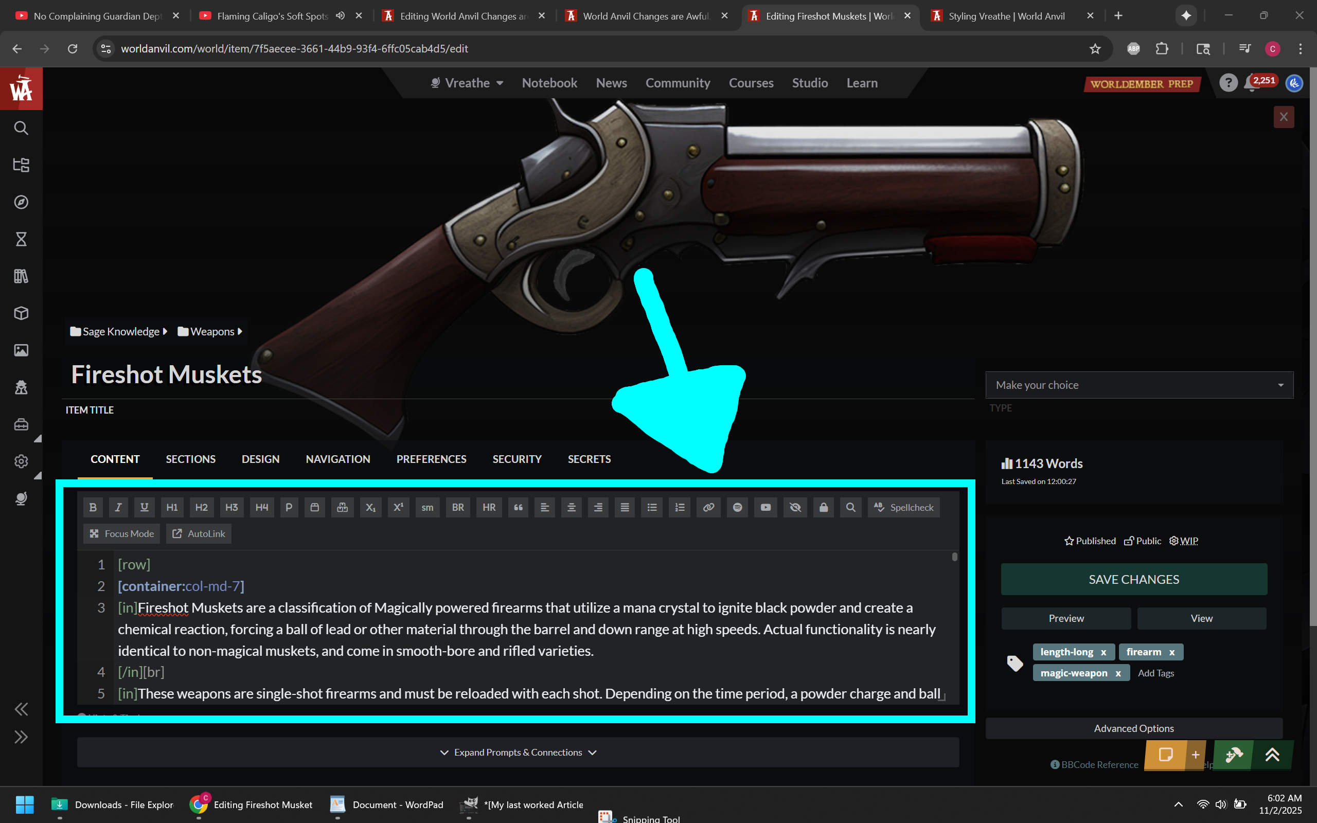
OLD EDITOR PAGE
The full page editor that is eventually going to go away. This would be fine if the new editor page had the same basic functionality that comes from being an actual full page and not a modal overlay.
EUCLID EDITOR (ADVANCED EDITOR)
Some people mistakenly refer to this as the "Old Editor" and I might be guilty of that too. Here in this article I attempt to clarify that when I say old editor I mean the old editor PAGE, not the text editor. Many people also mistakenly think that this version of the text editor is going away eventually. From what I can tell that is not the case.
Dashboard and Article Manager Feedback
NOTE (11/5/2025) - The UI was recently updated. Clicking on an article in the "Continue Working" Section will take you to the Edit page for that article. There is also an ellipsis (three dots) that appear on hover on the right side that opens new options, including the ability to go to the old edit page. You can also now right-click or middle mouse click on all available link options to open articles and categories in new pages. Gray text indicates points that are no longer valid.
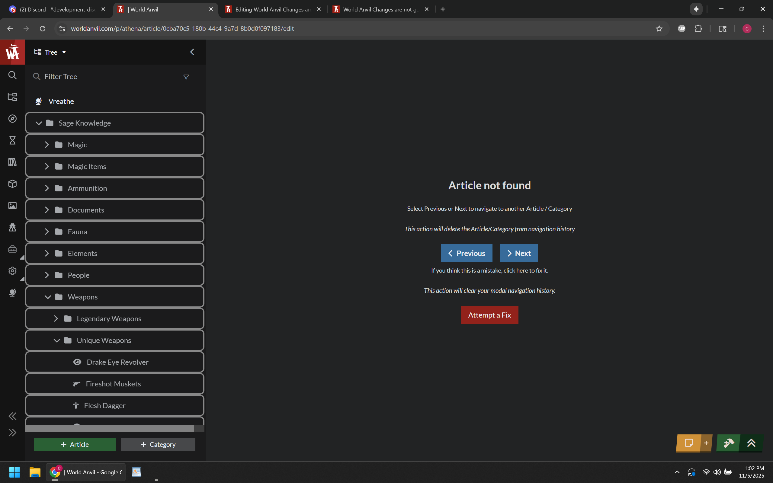
There is now a new bug where if I click to continue working on a Category (and go to the new version of the edit page), then the site acts as if the category doesn't exist. Going to the old version of the Category edit page does not cause this problem. Clicking attempt to fix just navigates away and opens the world overview.
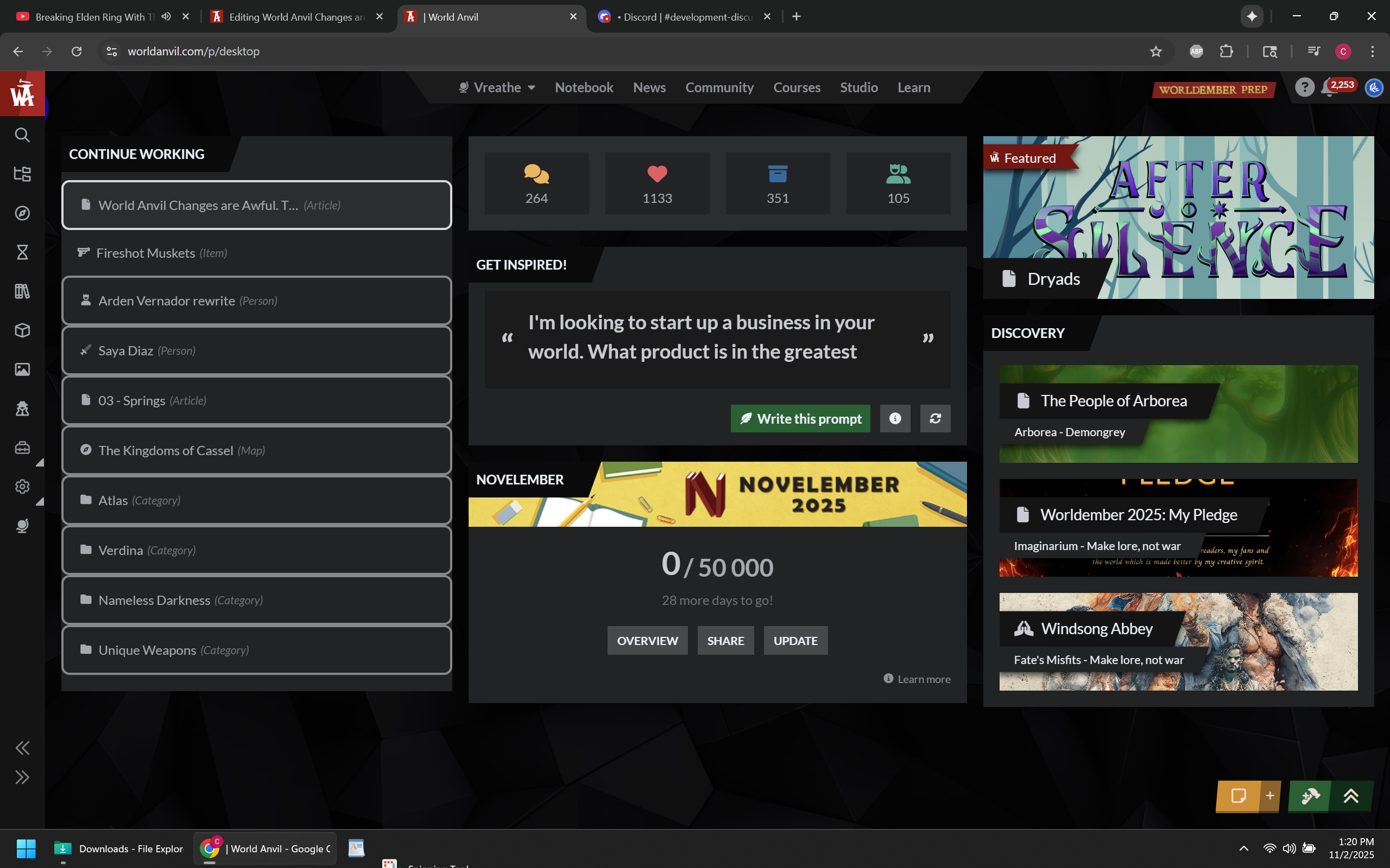
On the Dashboard, the first thing there is Continue Working, which... cool? In order to actually "continue working" though, you have to click on the article, then click on the edit button. Otherwise it brings up the Article Viewer. the Article Viewer is 100% useless to me specifically because my worlds have so much custom styling that... well, things can get weird, especially with images and custom containers.
It also does this for categories, going to that viewer instead of the edit pages. Also, I don't understand why this section even brings up categories.
The categories appearing in the continue working section were last updated back in June, so if it's just going to pull a certain number of categories categories to display no matter when they were last edited, the list should just do articles...
Clicking to "continue working" on an article from that menu should also have an option to open it in a new tab, whether that involves adding a new button, middle mouse click, or something else. I do not understand this "one tab" philosophy WA is trying to push...
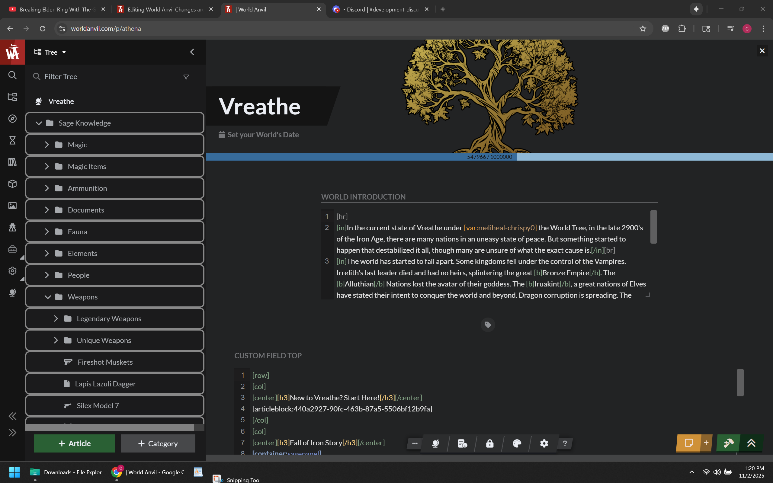
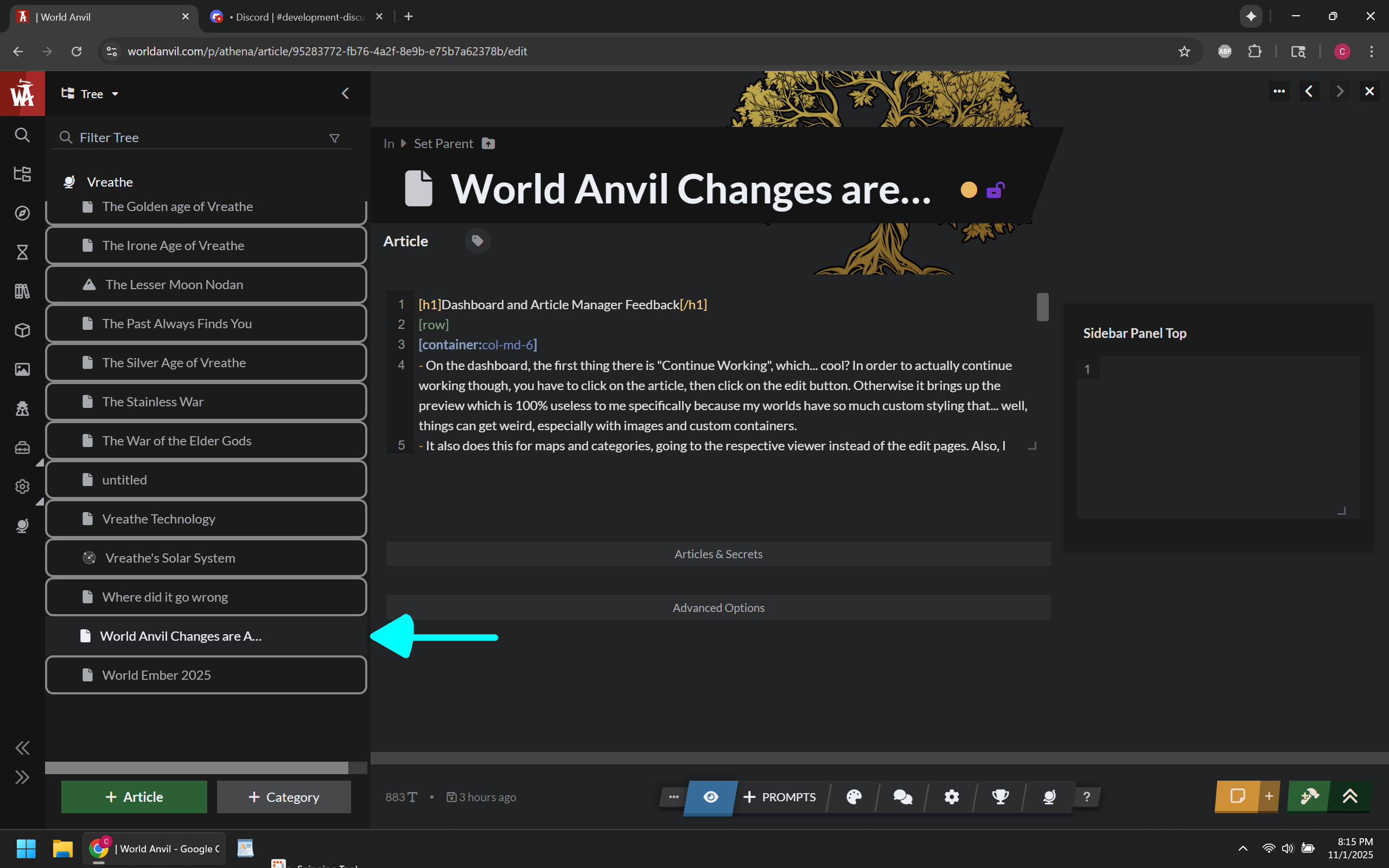
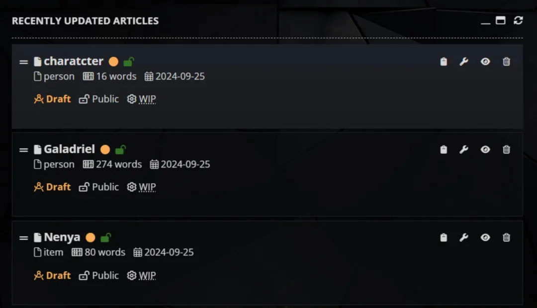
Since the page opens the Article Manager first, I have to find the article I was last working on... In this case (see image), it's all the way at the bottom of the list because uncategorized articles are sorted alphabetically.
What does the best version of the article manager show at first glance that the new version doesn't?
whether it's a draft or not.
whether it's public or not.
whether it's a work in progress or not.
article category.
word count.
last date updated.
I'm probably missing something but I made my point. The older versions of the article manager was simply more effective at showing more information.
I had to scroll literally to the bottom of the content tree to get to the most recent article I worked on. Compare to the old article manager (example below) which defaulted to showing your most recently worked on articles.
For the Article Manager's Content Tree... It does two completely different things depending on how you got there.
If you clicked on an article on the Dashboard first (which brings up the page in view mode) then you bring up the article manager, it will only open articles in view mode, requiring you to click edit to edit the articles.
If you go there from anywhere else, it brings up articles in edit mode. Not an issue I guess, just thought I'd point it out.
Why are the scroll bars so tiny? This is regards to the World Overview, the Article Manager, Article Viewer, Notification, and the Content Tree in the article manager. Is it even five pixel wide? I had to squint to even see it. Can you make it at least 10 pixel wide or give me the CSS callout so I can do it myself? It is very literally useless at that size.
If the reasoning has anything to do with "mouse wheel" or "3rd mouse button", that's not good reasoning. If your website design requires the use of the middle mouse button for anything that you can't reach by left/right clicking, then it isn't good website design and you need to rethink the layout.
And yes, I get it, the new version of the article manager has a cool sorting list, so I can still see article views that way (or any of several other stats)... Except it's only the most viewed articles, and only the top fifty. That's cool, but I am ALWAYS more concerned about articles I recently created, which the old article manager actually lets me see at a quick glance. the new one does not. And no, clicking through the sorting list to see most recent articles does not help alleviate the fact that the function used to exist without having to find it first.
Mobile still feels awful to use
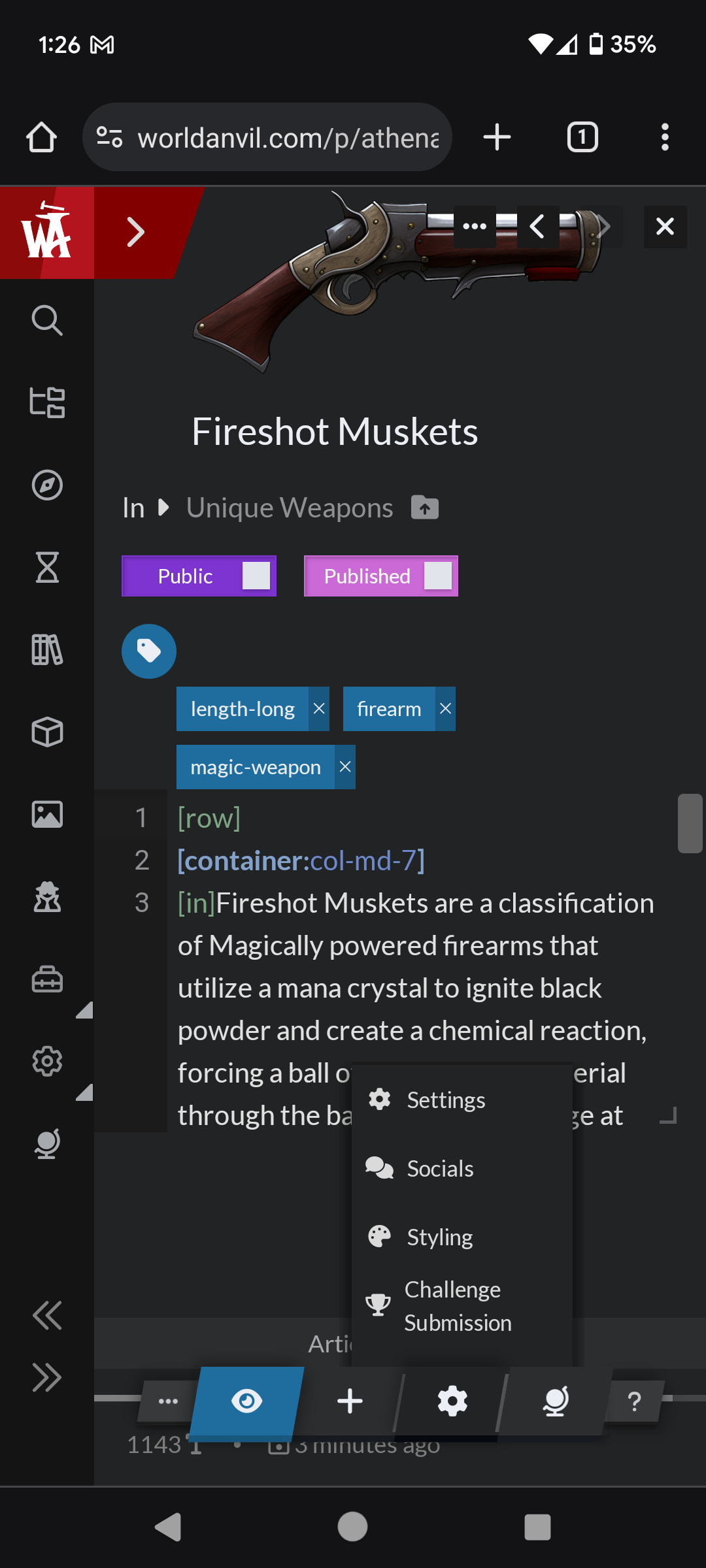
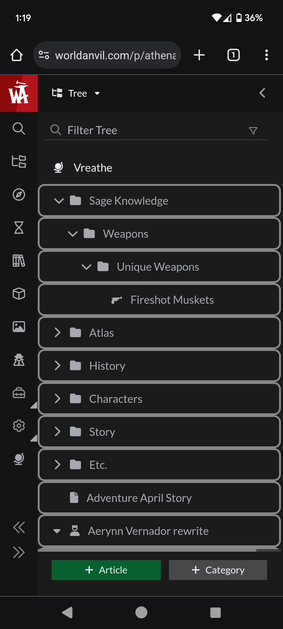
NOTE (11/5/2025) - Mobile UI also went through a few changes. Anything that is no longer relevant is in gray text like the last section. All the extra buttons are condensed into the cog button (including settings, socials, styling, challenge submission). Screenshots are below to compare to the rest of this section.
The bottom menu appears to have been shortened and is fully visible now. It does still cutoff the wordcount and last updated text but it's visible enough to see.
The menu also changed back to the icons, which I suppose solves the issue of the UI being shoved to the right for now.
Context on the phone feedback: When I access World Anvil on my phone, it is to check notifications and see how the pages look on a phone. I may quickly edit an article if I see something wrong and I'm not at home, also copy an article link to share with a friend. It's kind of a pain to do any of these things on the phone right now.
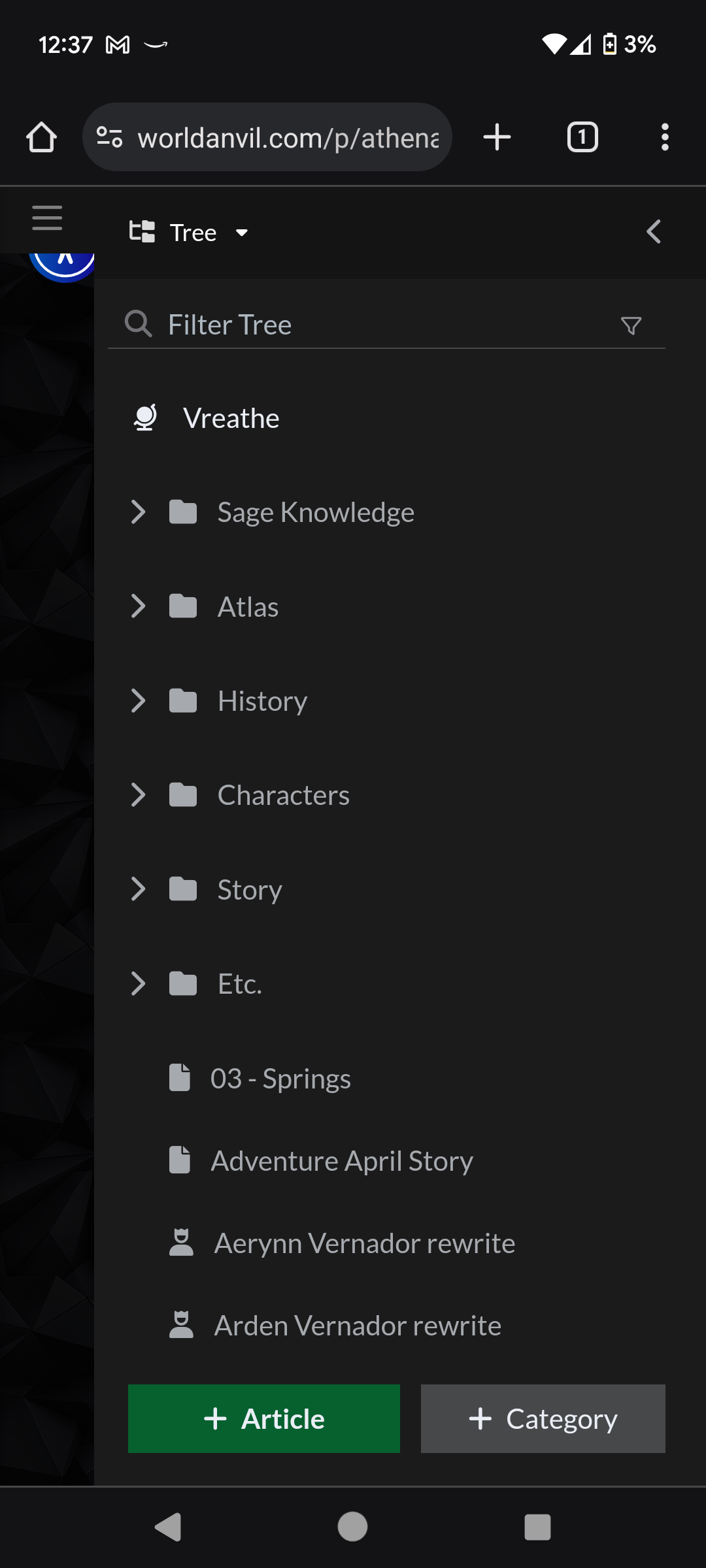
What I see when I first load WA from Mobile
This is the first thing I see when I load World Anvil from my phone. First off, there's already a visual bug with the entire menu being shoved to the right. I'm sure that will be fixed by the time I publish this, but I'm leaving it there. More importantly though... I load WA on mobile to see notifications and see how a page looks on a phone. Well, I can't do either from this screen.
If I want to see my notifications, they are hidden behind two menus. I have to close the content tree, and then close the World Overview. The site on mobile changed the main menu a little recently. Instead of icons, there is a list that you access with a button on the top left. As of this morning it would take just one tap to get to the dashboard (still too many)... But Since there is no more World Anvil button that immediately takes you to the dashboard, no matter what it takes two or more taps. It takes additional taps to access the community tab, challenges, profile, or anything else when it used to be immediately accessible from the start.
I should be able to see and access my notifications on loading into World Anvil.
The same is true for anything else on the dashboard page.
Why not just load the dashboard page by default like it originally was?
Accessibility button is hidden. I don't use it, but kind of weird that this was overlooked.
Other bugs I have found on Mobile
The bottom menu stretches outside both sides of the screen. This is probably a result of making it a fixed size on mobile.
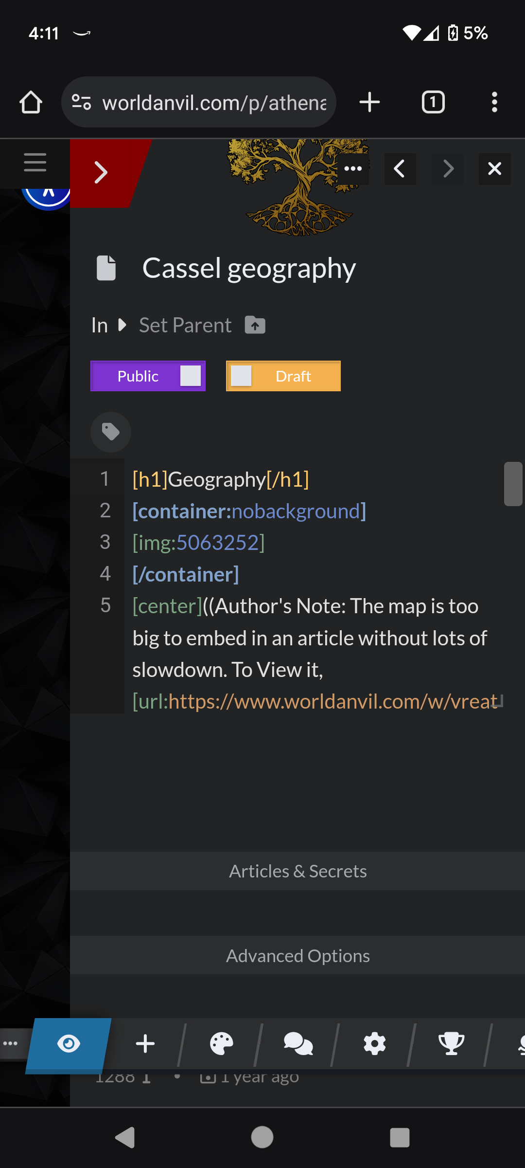
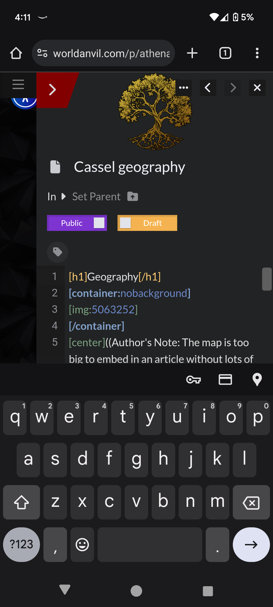
When I load into the new article editor, the on-screen keyboard pops up. I went through chrome looking for a setting that might have caused this, but I can't find anything. When I load into the old article editor, this does not happen so it's clearly not a bug with the browser I'm using.
The Main Event: Comparing Edit Pages
First: The Euclid Editor Changes from earlier this year
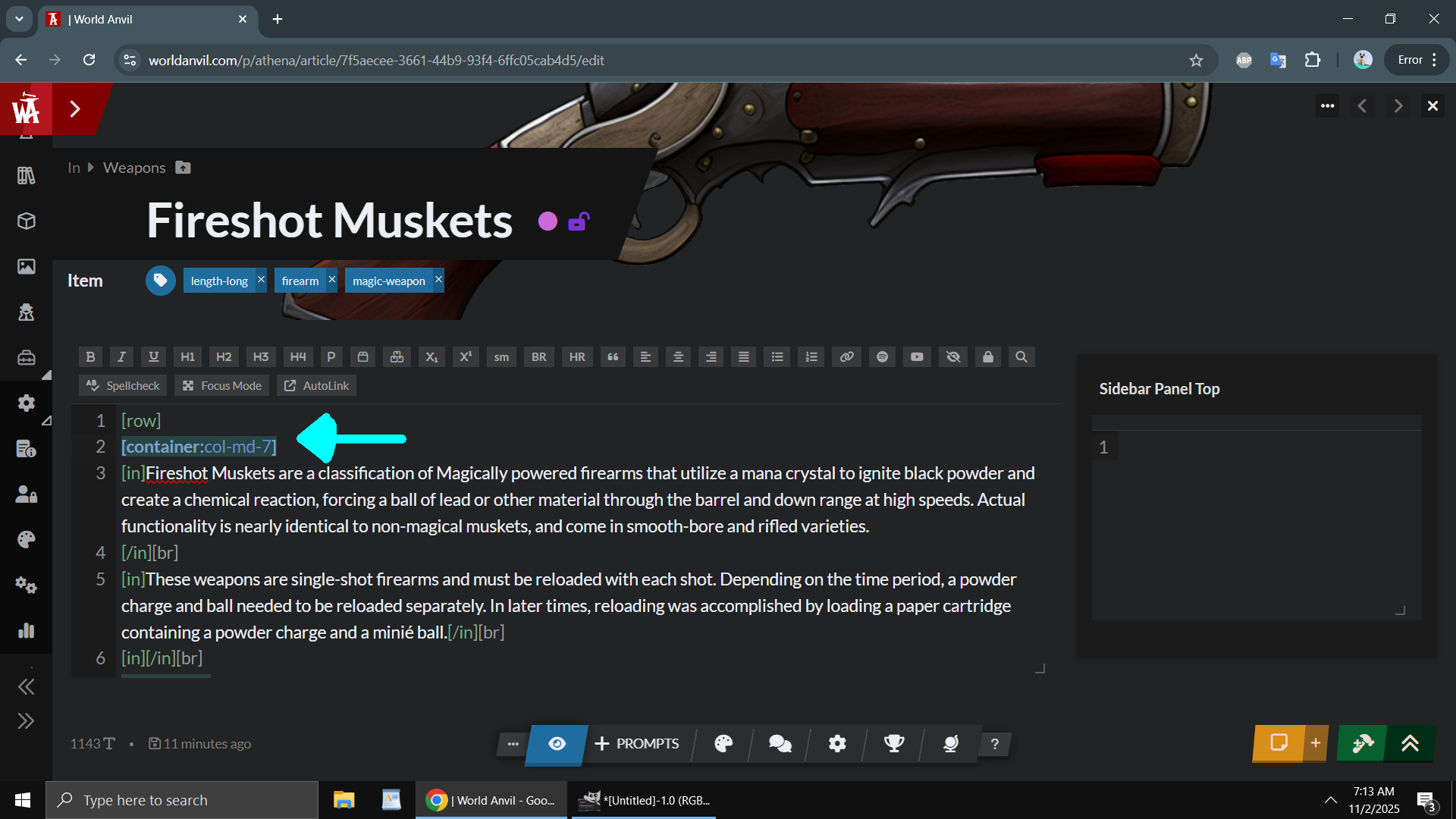
The image to the right is the Euclid Editor, as it was after an update back in February/March of this year. The Euclid editor changes were.... something. (screen was taken on an older laptop because my new one doesn't have a "print screen" button)
Significantly more colors were added to the editor when typing, probably to give it that tactile feel. Well, actually it was just obnoxious and annoying.
Yeah, I get it, I only typed one part of the container, you don't need to highlight the text in red.
Okay, I get it, I highlighted the letter "F" in the process of highlighting a word, you don't need to also highlight EVERY SINGLE INSTANCE of the letter "F" on the panel.
Never mind all the visual bugs that existed with the new colors at the time, and there are still visual bugs even now.
Also the "@" or "[]" mentions prompting me to type to search entities, then type two more letters, then one more letter got really annoying really fast because I've been using the Euclid editor for years and under the old version, nothing appeared until you typed three letters.
The toolbars were also acting different back in March, which wasn't the worst thing, but I already knew all the keyboard shortcuts, and combined with all the other visual bugs and annoying changes, it made the Euclid Editor basically impossible for me to use.
I experienced input lag for the first time ever with the Euclid Editor back in March, though that usually disappear after a few seconds, so whatever with that. It appears pretty much all the time on the New Editor Page and almost never on the Old Editor Page, and only on an older computer, so again, whatever...
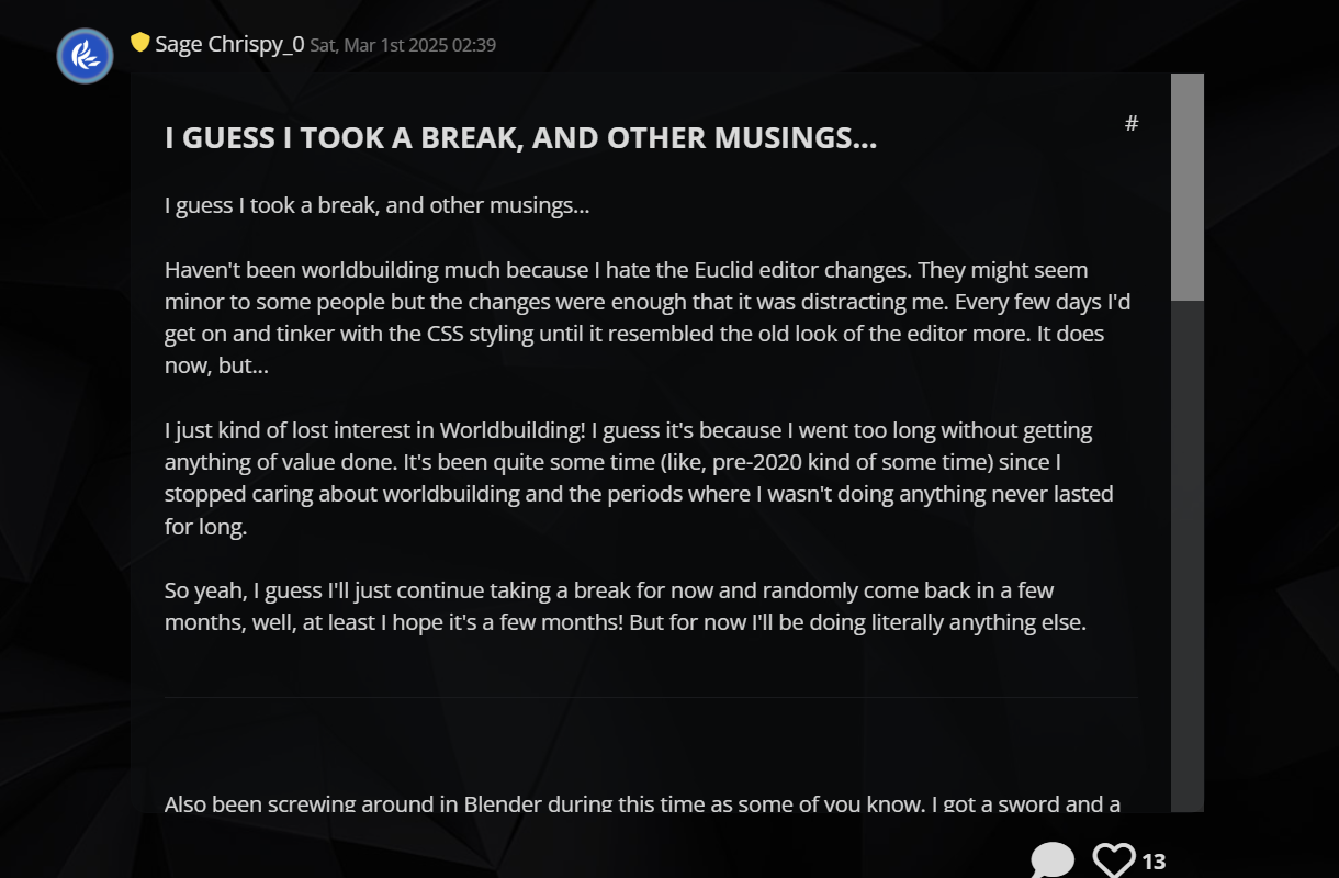
I seriously cannot understate just how annoying the visual changes were and how much it destroyed my workflow. I even made a journal post about it back in march about it. Spending days searching for CSS callouts to make certain things disappear so I don't have to see it kind of took the worldbuilding out of me...
For completion's sake, this is a screenshot of what I have after the editor changes I made after spending some time tinkering with the CSS...
Toolbar is gone. It was cluttering everything and is in the way.
It is also kind of annoying that it acts different in the new editor page compared to the old editor page. In the new editor page, the toolbars don't appear until you click on the the appropriate text box. In the old editor page, all toolbars are always displayed.
Whatever, I don't use them, so I removed them. Worked on both old and new editor pages.
No more annoying colors. No more red highlight when typing an obviously incomplete BBcode element. No more blue highlight when clicking on a completed BBcode element (that after some testing, still sometimes highlights the wrong one).
Unfortunately I couldn't get rid of the supremely annoying highlighted text. If I highlight "F", then all instances of "F" are still highlighted...
Another visual bug involves a BBcode element not having a color and appearing white, which would normally mean that it is incomplete somewhere. The problem is that it's not actually incomplete so I have to either ignore it or spend some time looking at my work to make sure it's just a visual bug.
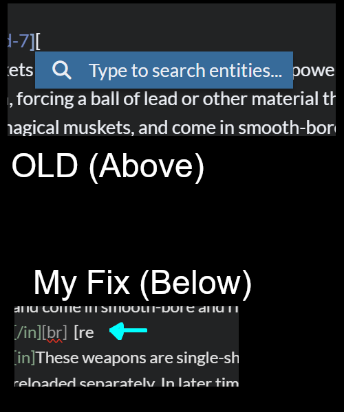
No more annoying prompt asking me to type to search entities, then type two more letters, then one more letter.
The fact that this prompt appeared as bright blue when I am in DARK MODE was kind of annoying too. I changed the code to make that darker and appear only after I type three letters.
"But Chrispy_0, none of these issues are dealbreakers!" " I hear you say "And you fixed most of them!"... And you are technically correct, conveniently placed strawman. The problem is that none of these issues occurred individually or independently of each other, and I had to fix them myself, taking time out of my worldbuilding just to make the site functional. And none of the issues or 'features' I ran into with the Euclid update actually made the experience better in any major way.
((think of it like this, all the visual feedback appearing seemingly at random in the Euclid Editor (and back in march when visually it was buggy as hell, it was quite random) was literally giving me a headache, not much different than someone getting sick from seeing the janky slide animations play on the new UI. That's why I am emphasizing this so much despite me having fixed it already. The tiniest things can cause an impact.))
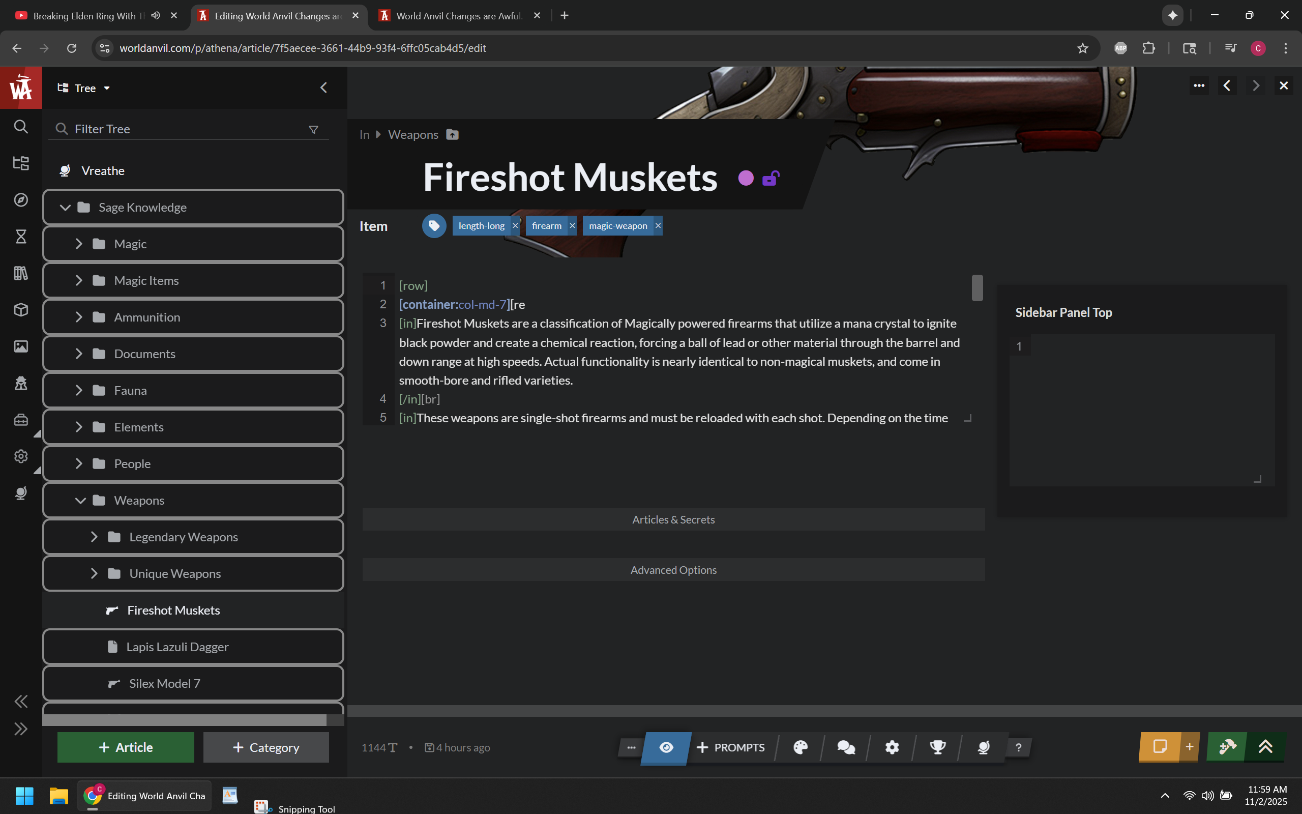
The Current New Editor Page
NOTE (11/5/2025) - There were a few updates to the new editor as well. Significantly more icons can now be picked, though RPG Awesome Icons still don't appear on some UI areas. The ability to disable the janky not-smooth-at-all animations was also added, and you can disable these by clicking on your profile icon on the top right of the screen, clicking on features, scrolling to the bottom, and then clicking on disable animation (refresh the page so they all disappear properly). Gray text indicates points that are no longer valid.
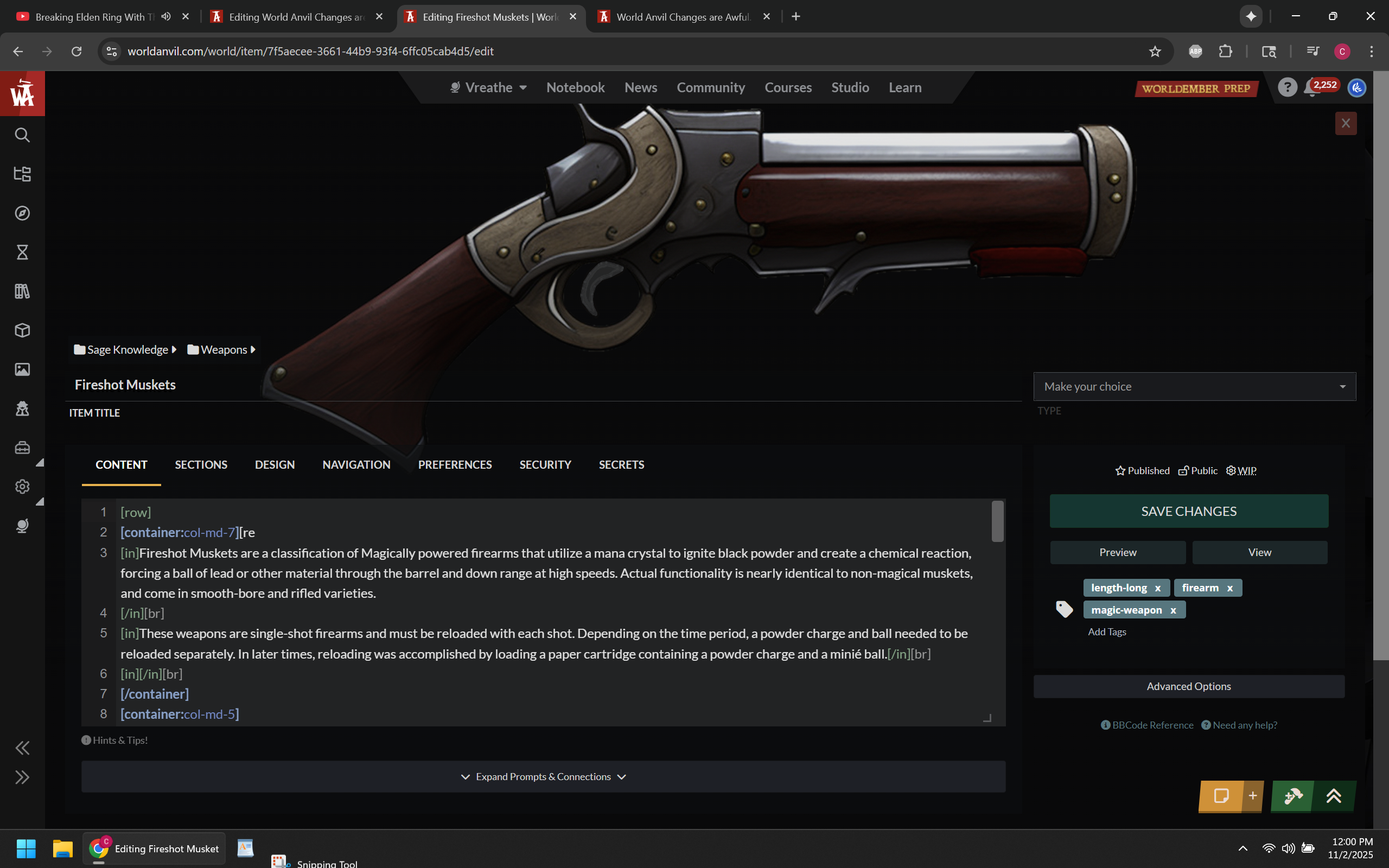
This is NOT a separate "page", it is still a modal overlay that just covers the entire screen now and I am tired of pretending otherwise.
Because it's just a fancy overlay.... going to almost any other function on the site navigates away from this page. If I want to create a variable for example, it closes the article editor and then opens the Variables, which only take up as much space as the content tree.
Instead of just being able to click away from variables and be back at the editor, you now have to scroll up and click on the article manager to reopen the article you were working on. This might be fine if you could just continue working on an article from the Dashboard, but I already established that you don't actually do that, it opens the article in preview mode instead.
This is true for almost every function on the left side that opens an overlay. It replaces the article overlay instead of keeping it open.
RPG Awesome icons cannot be added. Icons can only be added by searching for them from a list.
Font Awesome icons can only be added if they are solid classic versions. you can't pick duotone, sharp, or sharp duotone. You also can't use icons that use less then three characters because the search function doesn't pull anything up otherwise.
Opening and closing pretty much everything on the left panel has a slide animation, everything has to play that slide animation when you go to it. Pages don't load instantly, even on my 500 megabit connection. Even with that 500mb connection and a two year old computer, the slide animations don't play smoothly and there is always a delay in the animation playing.
Seriously, I should not be experiencing animation lag with this setup:
Processor: 13th Gen Intel(R) Core(TM) i9-13900H (2.60 GHz)
Installed RAM: 16.0 GB (15.6 GB usable)
Graphic Card: RTX 4070
- Notably I had to use an older computer to get screenshots with some things. That computer has an RTX 1650 and an i7, and 32GB of Ram. Literally everything on the site that involved a modal overlay lagged and took much longer to load compared to my newer computer. Glad I don't use that one anymore, but I kind of feel bad for anyone else who has an older computer, because they most likely are experiencing these issues.
This page exists as a singular solid, bland gray color. I'm sure the other themes will give it a different singularly bland color that makes everything merge together with no levels of distinction between various elements. Visually, things can definitely be improved.
You cannot see notifications. you cannot access the community tab, you cannot access your profile from this page. Everything requires you clicking away, defeating the whole point of this being a modal or overlay or however you want to define it.
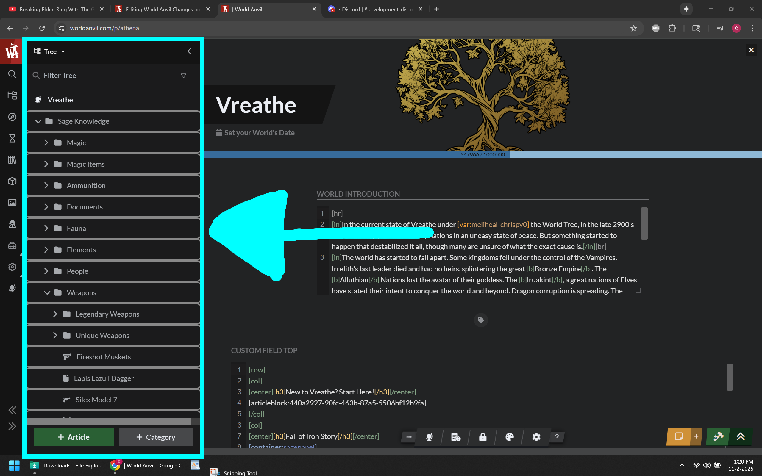
Content Tree is still open, so you have to close that first to get the new editor page to be its full size.
Still doesn't have all the functions that the Old Editor Page has.
On the older computer, I experienced input lag when typing in the new editor page. On the old editor page I didn't experience any. On my newer computer I only saw a few instances of this on the new editor page, otherwise I don't notice.
Just like with the Euclid editor changes, none of these are big problems by themselves in a vacuum. The problem is that all together they make the site experience all around worse and they far outweigh any benefit that I would have gained as a whole.
The Old Edit Page
Exists as an actual separate full page and has all the benefits of being an actual separate full page.
Since the Old Edit Page is an actual separate page, you can open any modal overlay you want and it won't navigate away and close, including the all important images and variables, and even including the newer versions of the article editor.
The old versions of these functions would navigate away because everything was separated into actual full pages, but you were also able to do something very simple that came with the benefit of being actual separate full pages, and this very simple thing has existed for about two decades...
the Ability to right-click on the mouse and select the option to open in a new tab or new window.
This allowed me to work on variables, images, and the article at the same time in separate tabs.
In order to replicate this function using the new article editor page, I now have to open World Anvil three times, then manually navigate to each function instead of just opening separate tabs from the start, otherwise the new editor page closes so the other ones can open.
With this very much built-in internet browser function removed, it makes navigating World Anvil a pain.
These other functions being overlays I can deal with, just not the article editor. with the old editor page, It doesn't navigate away and I originally thought that was going to be how World Anvil worked moving forward. It made variables for example easier to work with because you didn't have to open a new tab to keep the editor open.
You can paste anything you want in the icon box, making it vastly superior to the new editor page version. All possible supported icons are still supported.
The page loads almost instantly and doesn't have a laggy startup animation to opening it. there is no input lag in the editor itself, except maybe on an older computer.
Notice how everything on this page is subtly separated by different shades of grays and blacks instead of everything being collated together in the same solid color. And for things that are the same bland solid color, there is a visual tell to tell you where you are. The orange line below the content tab for example.
Has a manual save button. I get that it triggers the autosave and isn't really useful otherwise and you could also just type a character and delete it to also trigger the autosave, but it was an extra layer of safety knowing our work was saved.
Dev Statement about Editor Pages
Currently, the behavior of the Article Manager and New Editor Page closing when you open any other modal overlay from the side menu is intentional. They said they will eventually add the ability to open variables, images, and other side menus without closing the most important feature on World Anvil (the article editor).
I don't understand it, but since links to the old editor page were added to more places, this doesn't affect me for now because opening variables and images and other side menus doesn't close the old editor page, and anything that would you can force to open in a new tab. This does still (in my opinion) make working out of the old editor page the superior way to get anything done on World Anvil.
final note... Layout and colors
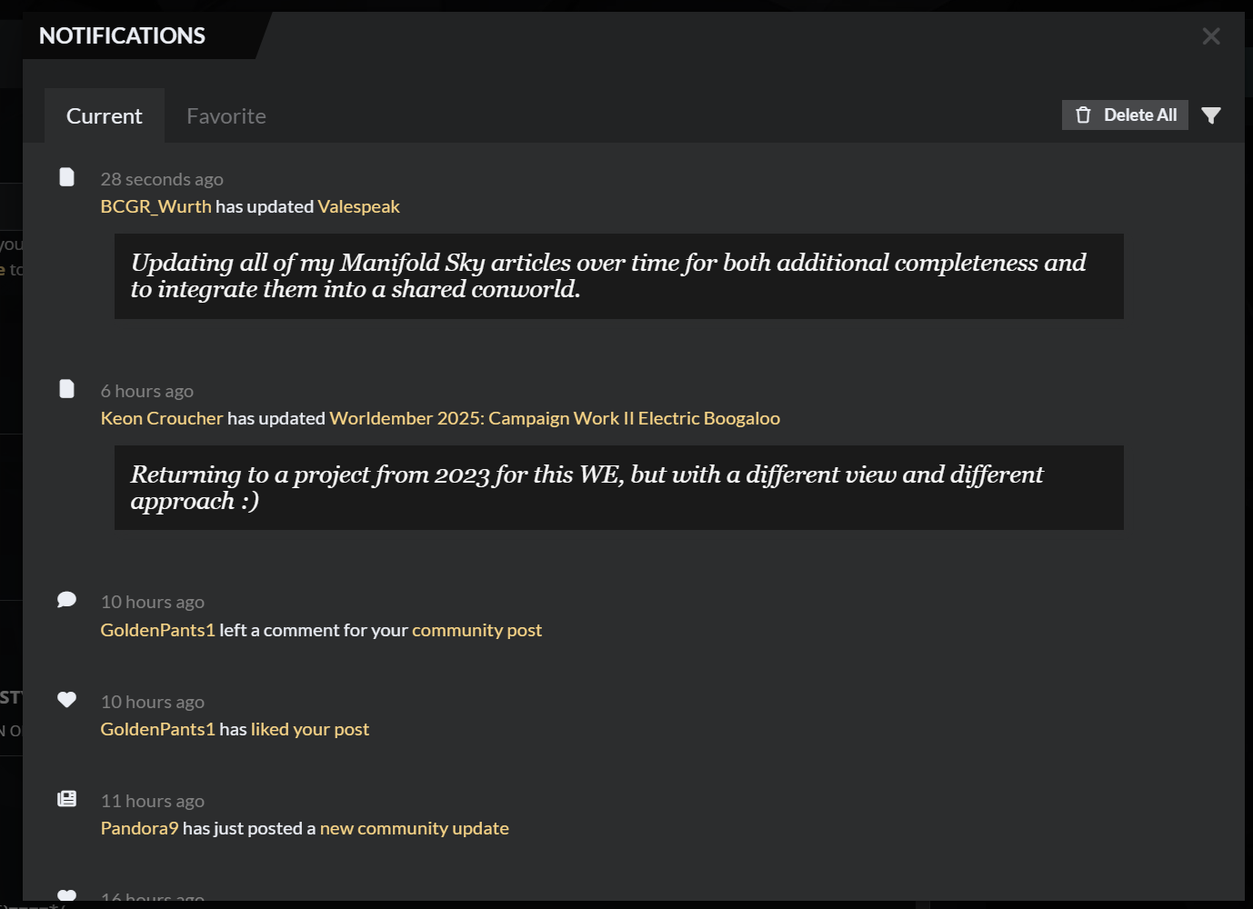
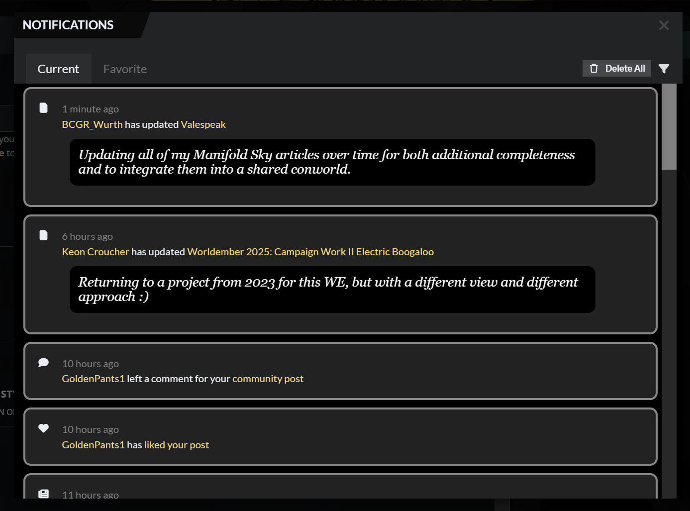
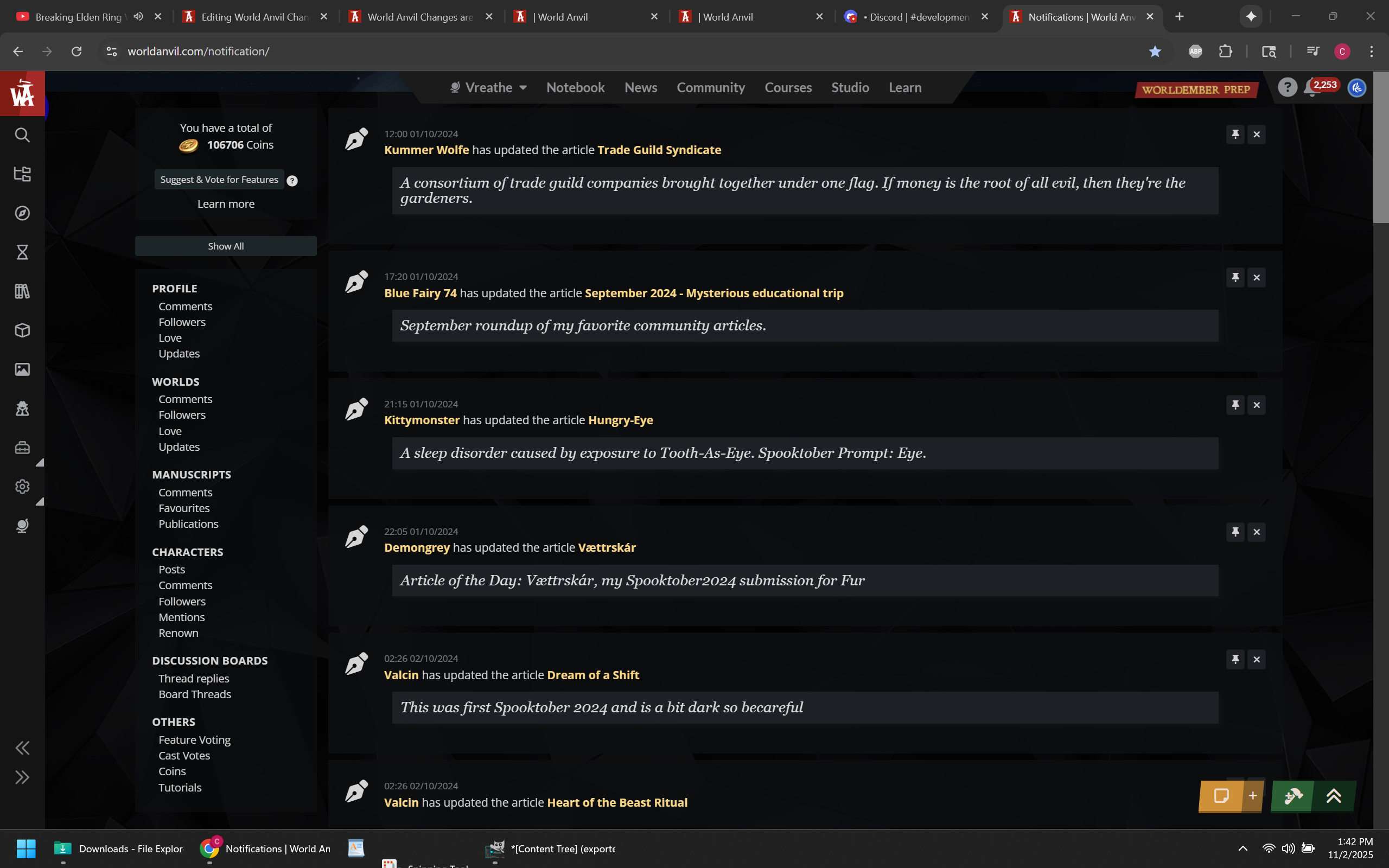
So much of World Anvil's current visual design is muddled and bland. It's difficult to look at and makes navigating certain elements kind of painful to do. All the on-hover effects don't help. Look at these two different versions of the Notifications overlay for example. The one on the top left is Default World Anvil. The scroll bar is tiny and only appears if you hover the right side of the panel (which I have overshot only to accidentally closed the notifications modal many times).
The bare minimum formatting I did on the top right image is almost infinitely better than the left (it's a work in progress, color and contrast needs work), with each notification being visually separated and the scrollbar being not only visible but big enough to use. The contrast on the old editor wasn't the greatest (see right image), but even that looks better than the current notifications. I also want to point out that because the old version of the notifications was a separate page, you could ctrl+f to search by username among other things, making it technically have more functions than the current version.
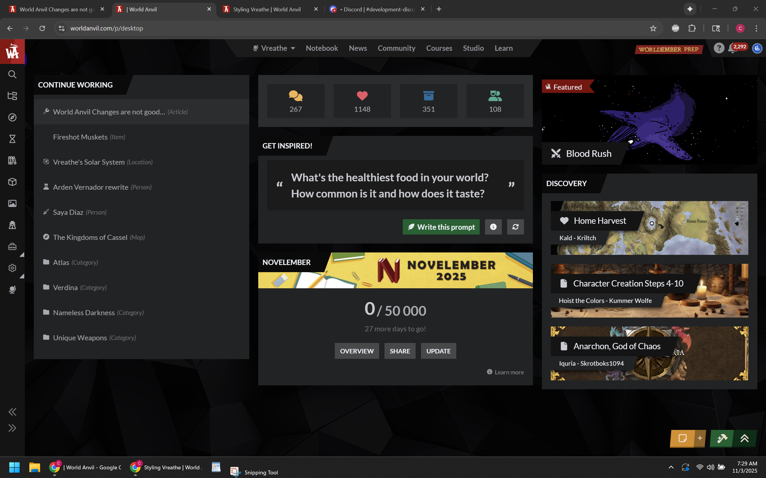
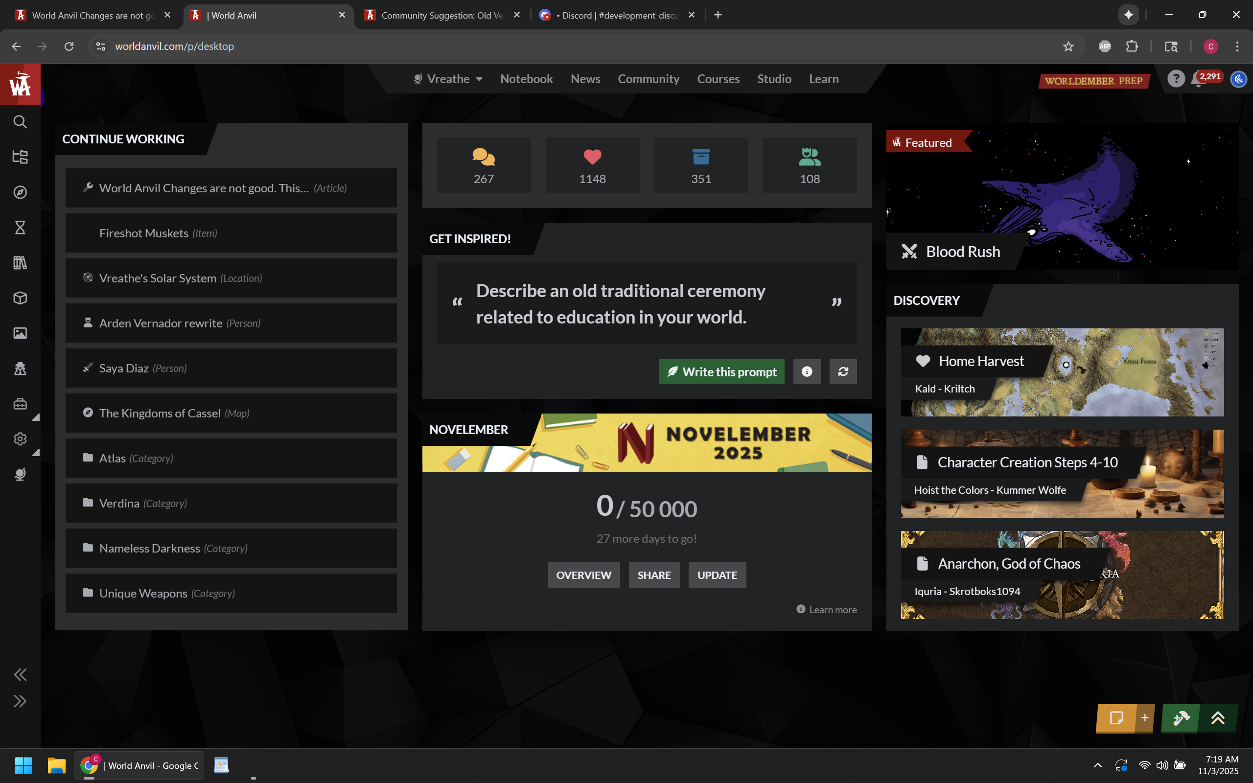
For a cleaner example of how cleaning up the layout and adding better color contrast can make something look way better, here is the dashboard with some CSS to fix contrast issues and make the "Continue Working" list a little easier on the eyes (well, my eyes at least). There is a few more things I want to clean up (The buttons on the "Get Inspired Panel" and the "NovelEmber" Panel both act different from each other for example). Also, RPG Awesome icons don't show on the continue working container. But until improvements or updates are made to the Dashboard page, this will be what I use going forward.
Other things
Look at all the screenshots I posted. Many of them have multiple instances of World Anvil open in different tabs. The reason is that I like working in multiple tabs on the browser, with each tab serving its own purpose and function. With the recent changes to World Anvil, it takes much longer to set up multiple tabs. Working out of one tab and opening up a dozen overlays is not any more functional or faster.
Thank goodness we are allowed to edit the CSS for the UI. If not, I would have abandoned ship way back in March. However, I did not appreciate having to spend days to get the function of the old Euclid editor back, and it's going to take days to get everything else in a working state for my personal workflow again.
I pay World Anvil 300 dollars a year to use their site and services. I expect it to work from the start. I do not pay World Anvil for the privilege of beta testing their products or wasting my time filling out bug reports.
If you are going to replace something that worked and worked well for many years with a different version that changes the layout and moves everything around, you should probably make sure that it is not just better than the old version in one or two areas, but in almost every way. What significant increase to functionality did we gain from these changes that wasn't already there before? In my personal opinion, the answer is literally zero.
Seriously, you guys need to stop streamlining things for the sake of streamlining things, especially if the act of streamlining something takes things away that were already there before.








This has been the best break down I have seen in the wake of this "update". I too have been pulling my hair out breaking their code, finding bugs and being far more consumed by this new layout with extremely clunky functionality than actually doing the thing I want to do. Write. I have spent the last few days doing just what you said, filling out bug reports, being ignored (mostly) in the help and development channels and all the feedback teams of WA are so disgustingly overwhelmed, that I haven't gotten anything back from them in days despite having filled out multiple feedback submissions. I couldn't agree more that I expect a product to be released that is legitimately better than it's predecessor. I never saw anything wrong with the old editor other than bug fixes and ease of life updates. They keep saying they built this ne UI from the ground up because they are tired of multiple technologies being used, but my argument has always been this. "Why did you implement multiple technologies in the first place?" $100 bucks a year I pay these guys, and now I'm feeling like an unpaid intern. Who despite giving them the feedback THEY WANTED, is largely being ignored.
That's actually a pretty good point.. Why implement multiple technologies to begin with? Unless they were planning to replace everything with whatever the new technology was from the very start. The old editor page, being on its own full page has always worked just fine. It could have used some quality of life upgrades and some streamlining (emphasis on some), but completely replacing it with everything different and moved around was not the right call. Also thanks for reading.