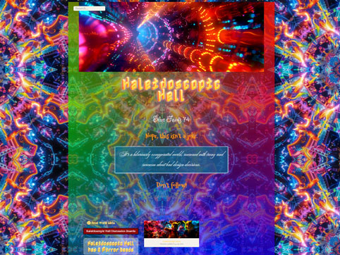
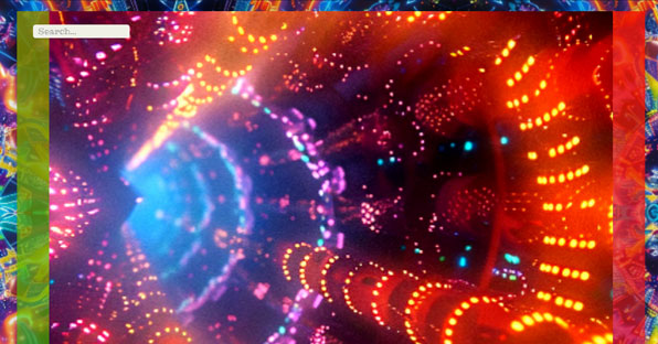
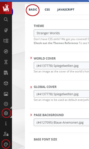
The background and banners should support your topic and articles without distracting them or creating a completely different mood than you want. Very often I see articles in which the background and banner are so intrusive that they completely disturb the flow of reading. It gets even worse if the content of the article is additionally bloated by many pictures or all sorts of "colorful" CSS in order to withdraw the content from the background and banner - a vicious circle!
Please also remember that some of your readers could have AD(H)D (attention deficit (hyperactivity) disorder) or RSW (reading spelling weakness), who will not read your articles if there are too many distractions.
Another problem is if you are literally overwhelmed by the article banner after opening an article because it takes up almost the entire browser size. Then you have to scroll a bit first to start reading. Please use narrow banners. What recommends a pixel size of 1,920 x 480. If you do not want to "cut" your article image with a machining software, you can also adapt the size to CSS. However, note that CSS has no influence on the loading time. I would always advise against it.
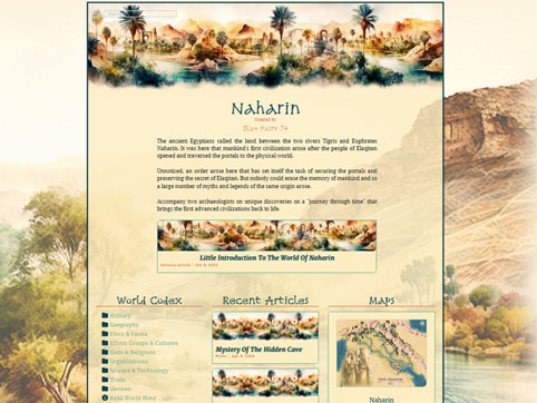
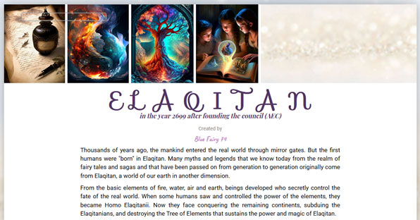
Some authors use individual article banners for just one article or for different categories, e.g. landscapes, fauna, flora, etc. You don't have to do that, of course. For my world Naharin, I only use the world banner. In contrast, in my world Elaqitan, there are many different banners that refer to the individual elements of my world theme. However, if you use different banners, compare the banner with your headline. Do the headline and your banner match or can you give us a preview of the article content? If you can't answer yes to either of these questions, then the banner may not be suitable for the article and you should reconsider your selection.
And if you are looking for some inspiration, you will find lots of banners on all sorts of topics here on the site of
Alan Byers Maybe you will find something suitable for you:
Sometimes it happens that the selected images (regardless of type) have a too high resolution and therefore your article takes some time to be fully displayed for a reader. Images on the web require a resolution of less than 100 dpi. In comparison, a resolution of at least 300 dpi or higher would be recommended for prints.
Many drawing and photo programs offer what is known as web-based saving, which reduces the resolution and file size of your images without "shrinking" the original file. If you have such options, use them. This also allows you to upload more images to WA, as the image library allows different storage options depending on the membership you have.




This was really helpful, thanks!
Thank you very much, I'm very happy to hear that.
Here are my Entries for the water continent Ulűri̋qi̋